I have finalised my personal branding on my work. My Business card, CV, portfolio and blog are complete. I have used my branding throughout to show consistency. My sketch book is up to date with my design processes and choices throughout the decision making.
My portfolio has arrived back from the printers and I am really pleased with how it has turned out. Everything has been carefully spaced out and the images are nice and big so you are able to get a good feel for my work and designs.
With regards to the web team, there are still a few students who have failed to upload their 3 pieces of work for their personal profile page. We were all set a deadline by Marianna to have it completed in time and they have still not managed this. We do not want the website to look unfinished so have decided as a team we will remove their image until they upload their work in the drop box.

Tuesday, 12 April 2011
Thursday, 7 April 2011
Week 11
This week we have been finalising things for the exhibition. As a group we have decided against the 3D paper boxes.
I have been working on my personal branding to complete my business card, CV and website.
I have designed my portfolio using software on my laptop that allows me to have it printed out like a book. I have designed each page, and carefully places my work throughout starting and finishing with my favourites pieces of work. I have also added brief content next to each piece stating how I achieved each design, what software I used and the process. I have also grouped each publication together so each piece that was created using the same software can be seen one after another. The front cover has my spiral/twirl design on it showing my branding. I have also included my contact details on the back page.
Sunday, 3 April 2011
The Meaning of the Colour Purple
I have chosen the colour purple to be used in this design. Not only is it one of my favourite colours but it is feminine without being over the top. I found the information below on a website that describes the colour purple as:
'Purple is the color of Spirituality. It urges us to find our power within, not the kind of power that needs to control or dominate others, but power rooted in connection to Spirit. A good color to use in meditation. Soothes mental and emotional stress. Purple is associated with wisdom, dignity, independence and creativity. Purple has been used to symbolize magic and mystery. Purple is a favorite of creative people. Whether wearing it, living in it, or creating with it, purple is a color for the adventurous heart with spiritual leanings and a flair for drama. This is the heart that knows the magic of purple. Purple is a combination of blue and red. Red is a focusing, dynamic and active energy while blue is cooling, calming and passive. The coalescence of liveliness and tranquility allows more creative energy to emerge. For this reason, purple is associated with imagination and inspiration. Light purple such as lavender is feminine and romantic. Purple is the color of dignity and self-respect ... it imparts determination and feeling of being in control, clears the mind of negative influences, calms nervousness and relieves stress. Purple is associated with royalty. It symbolizes power, nobility, luxury, and sophistication. It conveys wealth and extravagance. It is also feminine and romantic. However, because it is rare in nature, purple can appear exotic or artificial.'
Friday, 1 April 2011
Experimenting with colour
I have used my business card layout and decided to experiment with different coloured swirls and twirls. Using the colour palette I have matched colours which I think work well together onto my business card.


I am still happy with the original purple and pink colour. I will use this on all of my personal branding as I think it works best.
Thursday, 31 March 2011
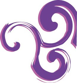
Personal Branding Update:Swirls & Twirls
I watched a really good tutorial online using Adobe Illustrator showing how to create swirl/twirl designs. I have researched the graphical representation of the spiral/ swirl and found a great article of what it represents.
In various mythologies the spiral is a globally positive symbol. Here are some of the meanings that have been attributed to the spiral.
Carl Jung, the famous psychiatrist, said that the spiral is an archetypal symbol that represents cosmic force.
In ancient Britain, the spiral seems to have been associated with the feminine as the doorway to life.
It has been associated with the cycles of time, the seasons, the cycle of birth, growth, death, and then rebirth. The cycles of time and nature are the cycles of life.
Some consider the spiral a symbol of the spiritual journey. It is also considered to represent the evolutionary process of learning and growing. It seems that life doesn't proceed in a straight line. The path of life more closely resemble a spiral. We seem to pass the same point over and over again but from a different perspective each time. To walk and then stand in the center of a spiral or labyrinth has been a psycho-spiritual exercise for centering the consciousness.
I feel the spiral represents me well. My branding is being used to help me on the next step of my journey, showing my growth from University student to full time employment in something I am passionate and enthusiastic about. I decided to give it a try on a business card. I created shapes and used and the twirl tool to create the designs experimenting with different shapes and layout.
I feel this design is more feminine and it is the most popular chosen colour of young adolescent females. The chosen colour scheme is purple and pink. I feel these colours represent me as they stand out and are feminine. The colour purple represent the emotions and meanings of calming, creativity, wisdom, dreams and is uplifting. The pink colour edged on behind the purple works well and compliments the purple.
The swirls and twirls identify my easy going nature as they continue off the page. The font used is American Type Writer, I have chosen this font as the end of some letters swirl just like the design patterns on the page. The black text stands out and makes it easy to read. It is not too bold and harsh and does not outweigh the design.


Below is an image of my business card using the swirls and twirls idea. The blue line breaks up the front and back of the card, with the swirls continuing onto the back. The side with my contact details on is the front of the business card.
As you can see from the screen shot below I have used the same branding and experimented using it in my CV.
I have also used the branding to see what it would look like on my website.

Wednesday, 30 March 2011
Thinking Outside The Box.....
I am currently looking at some ideas of different ways to present my business card so it stands out is quirky. Looking at different layouts online has given me some ideas. Some ideas I have looked at are:
- Post it notes
- Pen
- balloon
- coaster
- credit card style
Tuesday, 29 March 2011
Week 10: Update
The web team has completed the website for the gallery, which is now live www.3rddimensionexhibition.co.uk/index.html.


Student Profile Page

Getting Here Page

Home Page

The content I have gathered has been uploaded and can be see on the homepage and contact us page. As a group we have worked really well to get it finished before the exhibition. This was one of our aims as we wanted viewers to be able to check the website before the exhibition begins so they have access to the relevant information. Everyone has contributed individually to the process and we have been able to bring all the different elements together. The Facebook page that was set up has really helped us as a group to communicate outside of Uni. The Drop box folder has worked extremely well to allow us access to each others files and folders.
Chrissy has informed the group that she can get hold of boards that we can use during the exhibition to show our 3 pieces of work so I believe we will use these instead of the 3D paper boxes.
Subscribe to:
Posts (Atom)