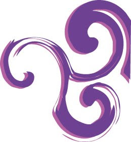
I watched a really good tutorial online using Adobe Illustrator showing how to create swirl/twirl designs. I have researched the graphical representation of the spiral/ swirl and found a great article of what it represents.
In various mythologies the spiral is a globally positive symbol. Here are some of the meanings that have been attributed to the spiral.
Carl Jung, the famous psychiatrist, said that the spiral is an archetypal symbol that represents cosmic force.
In ancient Britain, the spiral seems to have been associated with the feminine as the doorway to life.
It has been associated with the cycles of time, the seasons, the cycle of birth, growth, death, and then rebirth. The cycles of time and nature are the cycles of life.
Some consider the spiral a symbol of the spiritual journey. It is also considered to represent the evolutionary process of learning and growing. It seems that life doesn't proceed in a straight line. The path of life more closely resemble a spiral. We seem to pass the same point over and over again but from a different perspective each time. To walk and then stand in the center of a spiral or labyrinth has been a psycho-spiritual exercise for centering the consciousness.
I feel the spiral represents me well. My branding is being used to help me on the next step of my journey, showing my growth from University student to full time employment in something I am passionate and enthusiastic about. I decided to give it a try on a business card. I created shapes and used and the twirl tool to create the designs experimenting with different shapes and layout.
I feel this design is more feminine and it is the most popular chosen colour of young adolescent females. The chosen colour scheme is purple and pink. I feel these colours represent me as they stand out and are feminine. The colour purple represent the emotions and meanings of calming, creativity, wisdom, dreams and is uplifting. The pink colour edged on behind the purple works well and compliments the purple.
The swirls and twirls identify my easy going nature as they continue off the page. The font used is American Type Writer, I have chosen this font as the end of some letters swirl just like the design patterns on the page. The black text stands out and makes it easy to read. It is not too bold and harsh and does not outweigh the design.
Below is an image of my business card using the swirls and twirls idea. The blue line breaks up the front and back of the card, with the swirls continuing onto the back. The side with my contact details on is the front of the business card.
As you can see from the screen shot below I have used the same branding and experimented using it in my CV.
I have also used the branding to see what it would look like on my website.


No comments:
Post a Comment