
The Apple card I like because it is plain and simple and straigh to the point. The text is clear and easy to read and is not overloaded with irrelevant information. The Apple logo is large and placed in the centre of the card,which immediately shows brand identity. The amount of text is kept to a minium, with the persons name, job role, shop address, telephone number and website. I think there is a sufficient amount of information on the card to know how to contact the person. The text colour is grey, which is clear and easy to read. The name of shop is in bold, situated directly under the Apple logo.
The next business card I have is a Doctors. The card layout of the text is landscape. The card has noticeably more text on it than the Apple one. The Doctors name and job title is situated at the top. Below this is a list of clinics and hospitals where he works. The telephone numbers are also present with his email address. His secetray name and telephone number is aslo present on the card. All the text on the card appears relevant and has been positioned to maximise information given. The colour scheme is grey and white which is a good contrast as it stands out. The text also varies as some is written in bold. I think this card is a good example of how to get the most from a business card as he has used most of the card leaving very little white space.
The first few busines cards I looked at were card and average size. This next business card I found online. I really like this one because it is different, minimaloistic and innovative. The card has hardly any text apart from a name and email address, but in this persons case this may be all they need to have on it. The main focus on the card is the image of the blocks. I like how the writing has been placed on the wooden block so it looks engraved. I have never seen a business card like this before and like how it differs from just plain text.

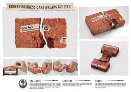
I have found some intersting business cards online that do not all conform to you average card. They show innovative designs highlighting how creative you can be.


I have also started looking at some CVs for research to get an idea of different layouts and formats. There are so many different styles and formats to use that I had not of even thought of. You really can be as creative as you want too.


Research has really helped me to generate some ideas. I am now going to experiment with different layout designs, maybe just sketch a few out and see which ones I like the look of.
No comments:
Post a Comment